As our game was intended to be a zombie game, we had lots and lots of sources of inspiration.
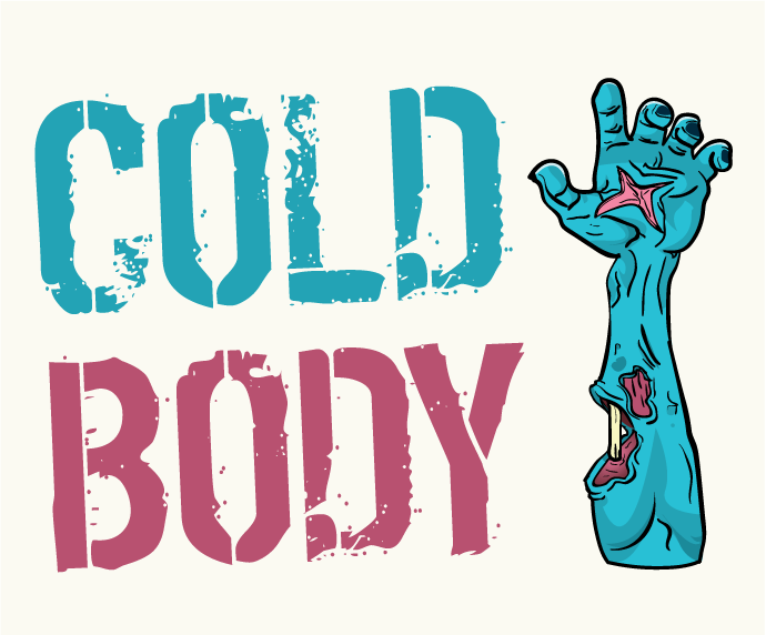
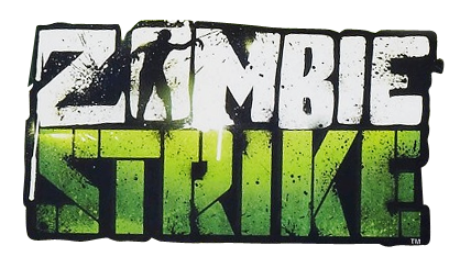
Firstly, the fonts used should have inspired something degraded, because the story behind our game is based of some kind of a post-apocalyptic surrounding. At the same time, it had to be something not so serious, a balance between something cartoon-ish and very professional.
Here are some examples that we explored.
![]()
![]()
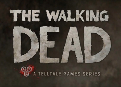
It can be seen that a more simpler method is approach for the design and color choices.
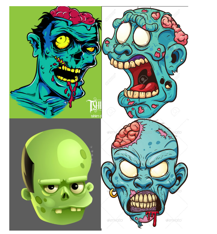
Diving further into our choices, the color scheme was inspired from various zombie-like faces and bodies. Some examples can be seen below.
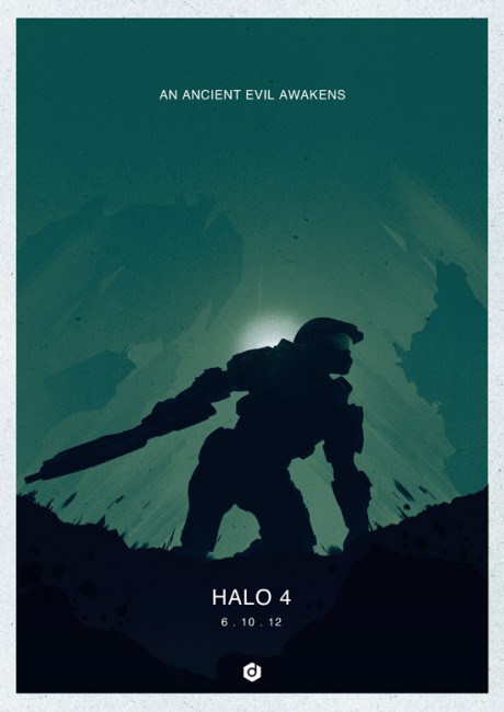
Moving to the posters, the technique here was different. The idea behind our 2 visual creations was taken from various inspiration sources, combining different aspects of popular game titles or other stunning concepts.
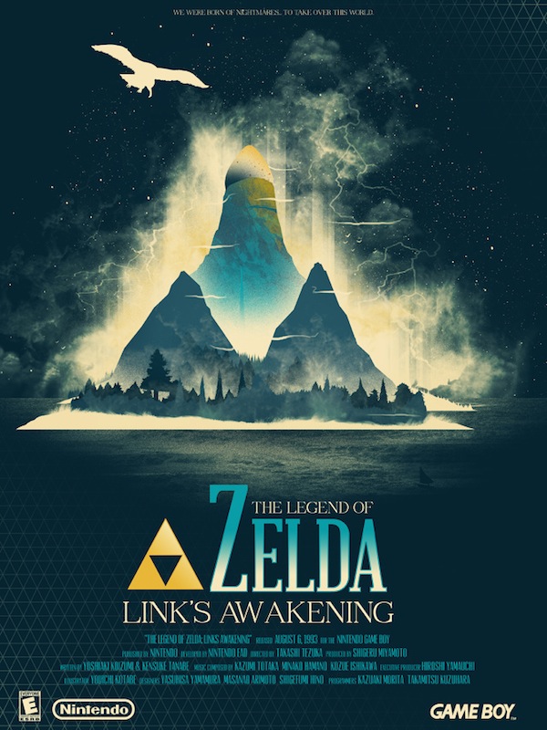
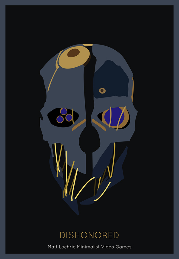
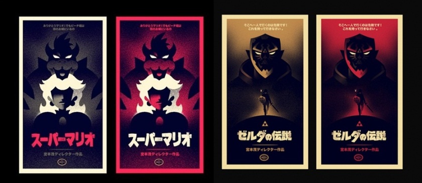
Some are more simplistic and some are more complex, with more detail to them. We tried both, because different people have different tastes and we aimed to visually please everyone.
Truth is our current times are embracing a simpler approach to designs and posters are ‘suffering’ from this effect as well, but with the right strategy and imagination, this simplicity can turn into complex and beautiful designs.
The UI of our game was the most difficult to make because we had to incorporate many aspects that had to combine between each other. This and at the same time it had to create a pleasant experience for the user.
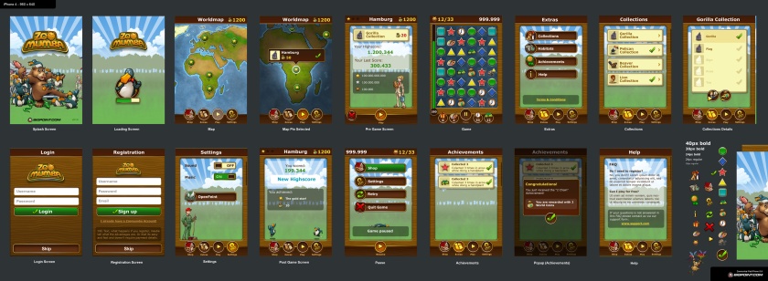
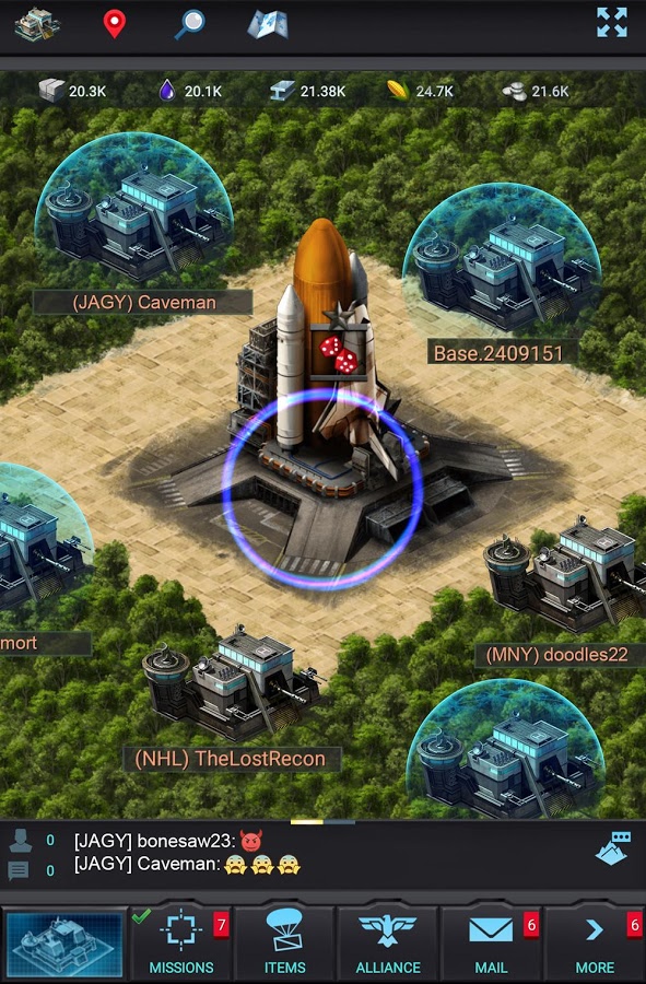
We did explore elements from different popular games on the market to create the perfect attractive, fun and in-theme UI.
